


🧠 My Solution for the above problems
◽️ Smart Widget
🎯 Potential Impacts
Quick Glance Policy Overview: Provides users with a compact summary of all active policies (health and vehicle) without needing to open the app fully - reducing friction and boosting user convenience.
Mobile-First, Real-Life Utility: Aligns with mobile UX best practices by addressing real-life scenarios like accidents or health issues where immediate access to insurance info is crucial.
Emotional Security Touchpoint: The shield icon and family/vehicle references subtly reinforce a sense of safety and protection, appealing to user emotions and building trust.
Boosts User Engagement
Encourages more frequent interaction with the app by keeping essential information readily visible, which can increase user retention and satisfaction.
1
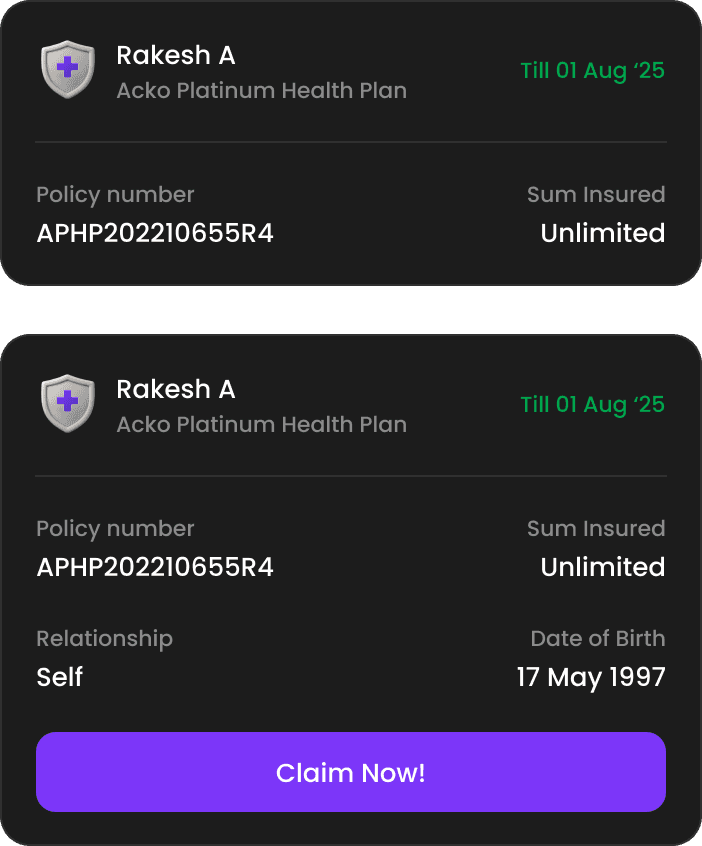
🧩 Default Policy View Widget
🟣 UX Impact
Gives users an at-a-glance summary of all their policies.
Reduces the need to navigate deep into the app.
Clear categorization (health/vehicle) improves comprehension.
💼 Business Value
Increases daily app visibility.
Drives re-engagement by keeping users informed.
Lays groundwork for targeted cross-sell opportunities
(e.g., if one policy is missing)


2
⚠️ Warning Info Widget
🟣 UX Impact
💼 Business Value
3
✅ Success Info Widget
🟣 UX Impact
💼 Business Value
😇 Unified Policy List Screen
✨ User Experience Impacts
Improved Discoverability: Users can quickly locate all their active policies without navigating through multiple sections.
Reduced Cognitive Load: A clean, consistent layout reduces the effort needed to understand and differentiate between policies.
Faster Task Completion: Users spend less time searching for policy details (e.g., expiry date, insured amount, policy number).
More Accessible for All Users: Structured grouping and clear hierarchy support better comprehension for users of varying digital literacy.
📈 Business Impacts
Fewer Support Tickets: Less confusion means fewer calls or chats related to finding or understanding policy details.
Boost in Cross-sell Opportunities: Displaying all policy types together opens avenues to suggest complementary coverage (e.g., health + vehicle).
Improved Claim Initiation Rates: Clear visibility into active coverage encourages timely claims when needed.
Increased Renewal Rates: Easy access to expiry dates and policy summaries increases the likelihood of timely renewals.
🧠 Strategic Impacts
Unified Design System Implementation: Sets a foundation for scalable, reusable components across other insurance product views.
Better Data Utilization: Consolidated views enable better tracking of user behavior and preferences in policy engagement.
Supports Personalization at Scale: A consistent structure makes it easier to integrate smart recommendations and alerts per user.
🔍 Key UI Enhancements
1
More info in a glance

2
Clear Visual Grouping with Name Tags
Name tags added at the top improve clarity when viewing multiple policies in a family account.
A thin vertical divider visually distinguishes health and vehicle insurance types.
Active policies are outlined in green, while expired ones are clearly marked with a red dotted line.
3
Consistent and Recognizable Icons
Replaced inconsistent or outdated icons with a unified set across the app.
Icons now clearly represent vehicle, health, travel, and property insurances to improve recognition and trust.


4
Improved Promotional Cards for Better Engagement
Redesigned cards with better visual hierarchy and CTAs to improve visibility and click-through rates.
Color-coded themes now represent different categories of insurance offers, making discovery easier and more intuitive.

