


ELYXR is a fast-growing cannabinoid and mushroom-based wellness brand offering Delta 8, Delta 9, CBD, HHC, THC-V, and functional mushroom products. Despite strong product-market fit, their wholesale digital experience failed to support their growing customer base mainly young adults running businesses from their smartphones.
Key Challenges:
Cluttered navigation and poor product categorization
No quick reorder feature for recurring wholesale buyers
Limited support for mobile-first behavior
No actionable analytics for internal sales and operations
Low repeat purchases and high drop-off during checkout
The existing system was transactional, not relational. ELYXR needed an experience that was as sharp as their products.
I began by understanding the people behind the purchases:
Young, digitally native buyers managing dispensaries, stores, or reselling from home. These users needed speed, clarity, and trust on mobile not bloated desktop-centric flows.
Research Activities:
Conducted stakeholder interviews and studied support tickets
Built two key personas:
Solo young entrepreneurs (24–35) who order via mobile
Store managers restocking inventory monthly
Competitive benchmarking: Great CBD Shop, The Calm Leaf, TRĒ House
Mapped key friction points in the buyer journey:
Reordering takes too long
Products hard to compare
Filters are non-existent
Mobile site feels broken
Core Insight:
Buyers didn’t need a flashy interface they needed a tool that respected their time.


With clarity on who we were building for, I focused on a modular, mobile-first design approach optimized for clarity, conversion, and repeat behavior.
Design Process:
Reorganized the site’s information architecture
Introduced product filters (strain, potency, type, format)
Designed “Quick Reorder” and “Past Orders” modules
Created lightweight onboarding for new buyers
Built a scalable design system in Figma with responsive components
Designed analytics dashboards for ELYXR’s sales team to track trends, reorders, and top SKUs
The entire interface was optimized for tap comfort, mobile discoverability, and transaction speed.
The redesigned platform turned friction into flow for both buyers and the business.
User Outcomes:
Mobile-first experience allowed users to order anytime, anywhere
Reorders became 2x faster via new Quick Reorder system
Mobile product discovery time dropped significantly
Business Outcomes:
+35% increase in repeat orders in the first 60 days
-40% drop in bounce rate
92% of orders now placed from mobile devices
Reduced customer support queries related to navigation and reordering
Positive feedback from wholesale buyers and internal sales teams

Research and Design


User Research and Persona Development: Conduct user research to understand the needs, preferences, and pain points of wholesale customers. Develop detailed user personas based on this research to guide design decisions and feature prioritization.
Usability Testing and Feedback Loop: Implement usability testing to evaluate the current website's usability and identify areas for improvement. Gather feedback from wholesale customers through surveys, interviews, and user testing sessions to iterate and refine the user interface (UI).
Streamlined Navigation and Information Architecture: Simplify navigation and optimize the information architecture to ensure wholesale customers can easily find products, place orders, and access account information. Use clear categorization, intuitive labeling, and a logical flow to enhance usability.
Responsive Design and Mobile Optimization: Ensure the website is responsive and optimized for mobile devices. Wholesale customers often need to place orders on the go, so a mobile-friendly design with easy navigation and quick loading times is crucial for a seamless user experience across all devices.
Personalization and Customization Options: Incorporate personalized features such as recommended products based on purchase history, saved favorites or shopping lists, and customizable dashboards for each wholesale customer. Tailoring the experience to individual preferences enhances usability and encourages repeat purchases.

The Design

1
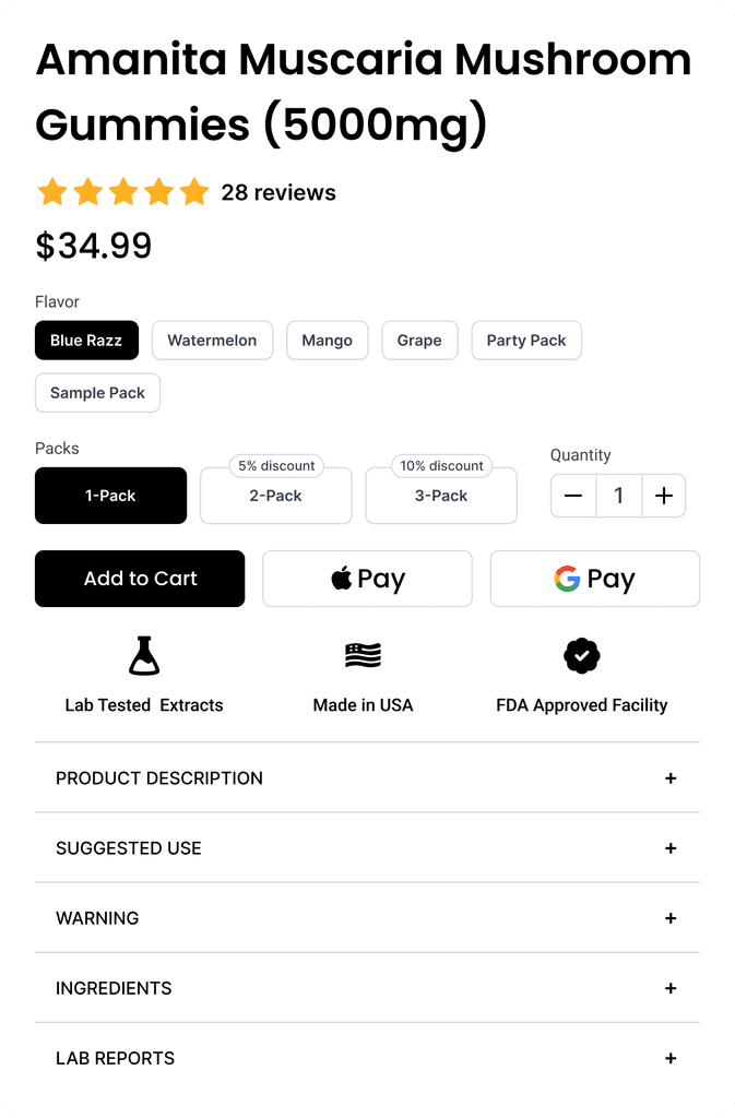
Redesigning the Product Page
Outdated Design and Poor Conversion Rate: The original product page was outdated and suffered from a low conversion rate, indicating a need for improvement.
Modern and Clear Redesign: The redesign focused on making the page modern and clear, enhancing its visual appeal and usability.
Improved User Experience: The changes led to a better overall user experience and a more modern-looking website.
2
Redesigning the Wholesale Website

Outdated Design and Poor Conversion Rate: The original product page was outdated and suffered from a low conversion rate, indicating a need for improvement.
Modern and Clear Redesign: The redesign focused on making the page modern and clear, enhancing its visual appeal and usability.
Improved User Experience: The changes led to a better overall user experience and a more modern-looking website.

3
Redesigning the Product Modal
Outdated Design and Poor Conversion Rate: The original product page was outdated and suffered from a low conversion rate, indicating a need for improvement.
Modern and Clear Redesign: The redesign focused on making the page modern and clear, enhancing its visual appeal and usability.
Improved User Experience: The changes led to a better overall user experience and a more modern-looking website.
4
Tier Mechanism

Basic Tier (1 - 5): This is the entry-level tier for all new customers or those with minimal purchase activity. Benefits might include standard wholesale pricing, access to the full product catalog, and basic customer support.
Mid Tier (6 - 10): Customers who make regular purchases or meet a specific purchase threshold move to this tier. Benefits may include slightly better pricing, occasional discounts, faster shipping options, and priority customer support.
Premium Tier(11- 15): This top tier is reserved for customers who consistently place high-volume orders or have been loyal for a significant period. Benefits might include the best pricing, exclusive discounts, early access to new products, dedicated account management, and free or expedited shipping.
5
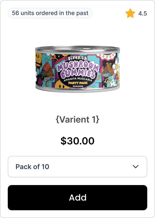
Product and Variant Card
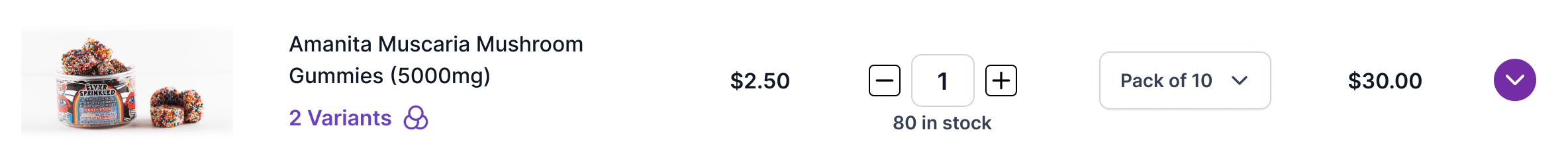
List View: On larger screens, products and their variants are displayed in a clean, organized list view. This layout features smaller images and a well-structured hierarchy, enhancing readability and user experience.
Thumbnail view: For screens with limited space, such as mobile devices and tablets, variants are shown as thumbnails with larger images and minimal information. This view is designed for easy browsing on smaller screens.
Toggle: On desktop, users can switch between list view and thumbnail view using a dedicated toggle. Each view is optimized for different screen sizes and user preferences, ensuring an efficient and pleasant browsing experience.
6
Analytics


Sales Performance Tracking: The screen provides detailed insights into the sales performance of the Amanita Muscaria Mushroom. Users can see the total units sold to them (789 units) and the average review rating (4.5), offering a quick overview of both sales volume and customer satisfaction.
Time-based Sales Analysis: The screen includes a bar chart that visualizes the total units sold over various months. This allows users to track sales trends and identify peak selling periods. The ability to filter the data by different time ranges (all time, 12 months, 6 months, 3 months, 30 days) enables users to analyze sales performance over specific periods and make informed decisions based on seasonality and trends.
Customizable Data View: The sorting option (e.g., by rate) allows users to customize how they view the sales data, potentially offering other sorting criteria to suit their analytical needs. This flexibility helps users focus on specific aspects of the data that are most relevant to their objectives, such as identifying high-performing months or understanding the impact of marketing campaigns.

